> ## Documentation Index
> Fetch the complete documentation index at: https://cometchat-22654f5b-docs-audit-content-webhooks.mintlify.site/llms.txt
> Use this file to discover all available pages before exploring further.
# CometChat UI Kit Builder For Android
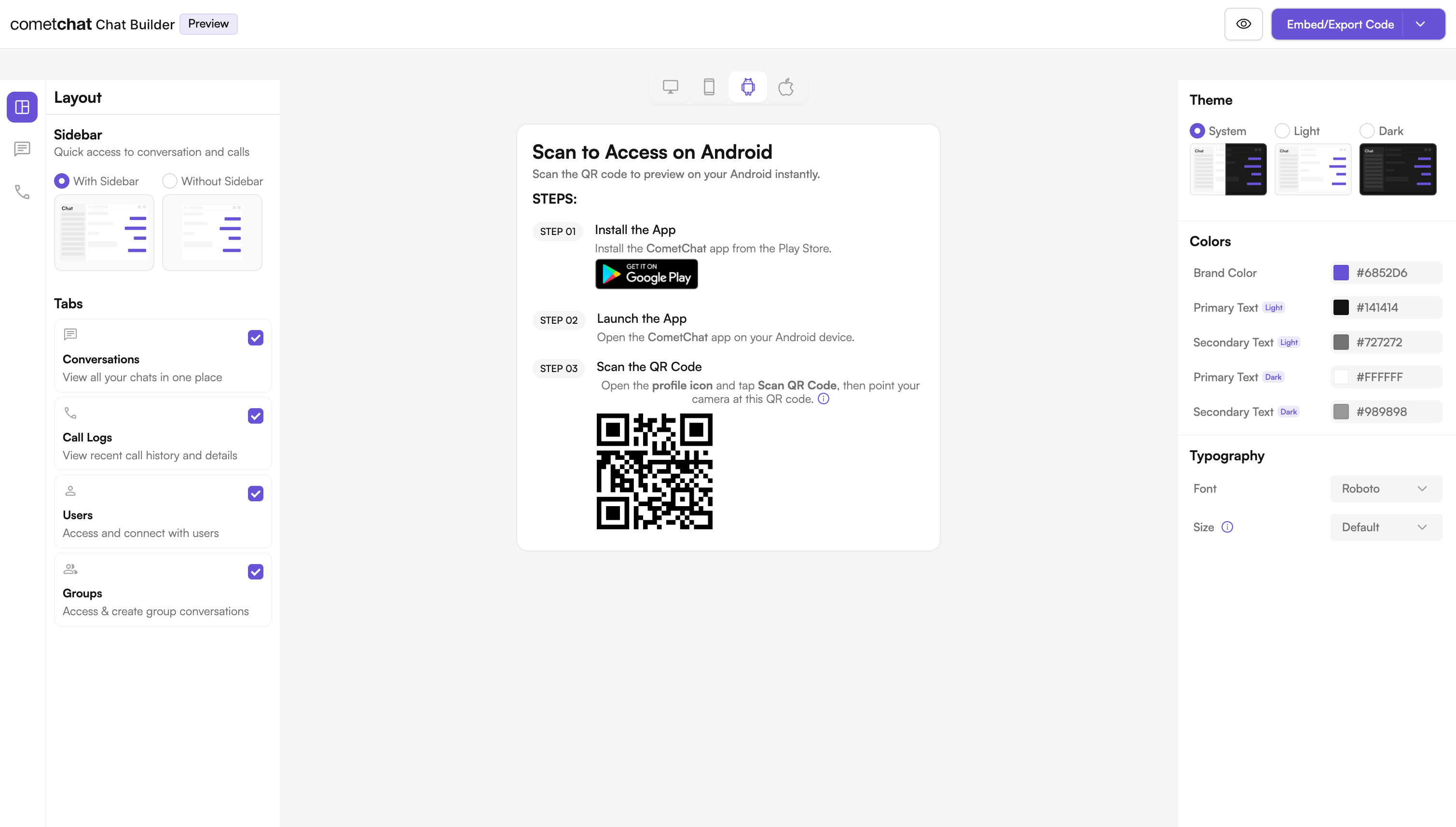
> CometChat UI Kit Builder for Android provides a pre-built interface to integrate a reliable, fully-featured chat experience into new or existing apps.
The CometChat UI Kit Builder for Android provides a pre-built user interface kit that developers can use to quickly integrate a reliable & fully-featured chat experience into an existing or a new app.
 ***
## What is UI Kit Builder?
UI Kit Builder is CometChat's configuration system that allows you to customize chat features, UI components, and styling through a simple JSON configuration file. The builder plugin automatically generates Kotlin constants and applies styling based on your configuration.
When you design your experience in the Builder and export the code, you receive a `cometchat-builder-settings.json` file plus a sample Android module. During a Gradle build, the `com.cometchat.builder.settings` plugin reads that JSON and generates `CometChatBuilderSettings.kt` — an object of type-safe Kotlin constants. A helper class, `BuilderSettingsHelper.kt`, then reads those constants and applies them to the standard [CometChat Android UI Kit](/ui-kit/android/getting-started) components (`CometChatMessageHeader`, `CometChatMessageList`, `CometChatMessageComposer`, and others).
The Builder is a configuration layer on top of the regular Android UI Kit — it does not replace it. Anything you can do with the UI Kit directly (custom message templates, view slots, themes) is still available after you integrate the Builder. See [Where the Builder fits](#where-the-builder-fits) below.
***
## Benefits of Using UI Kit Builder
| Benefit | Description |
| ------------------- | ------------------------------------------ |
| Easy Configuration | Change features without modifying code |
| Type-Safe Constants | Auto-generated Kotlin constants |
| Consistent Styling | Automatic theme generation |
| Feature Toggling | Enable/disable features dynamically |
| No Code Changes | Modify behavior through JSON configuration |
***
## Available Builder Settings Categories
The Builder configuration supports the following categories:
| Category | Description |
| ------------------------- | ---------------------------------------------------------- |
| Core Messaging Experience | Basic chat features (typing, file sharing, etc.) |
| Deeper User Engagement | Advanced features (reactions, polls, translation) |
| AI User Copilot | AI-powered features (smart replies, conversation starters) |
| Group Management | Group creation, member management |
| Moderator Controls | User moderation (kick, ban, promote) |
| Voice & Video Calling | Call-related features |
| Layout & Styling | UI customization and theming |
***
## Where the Builder Fits
The Builder gives you fast, JSON-driven control over **which features are on** and **broad styling**. For anything more granular, you drop down to the same customization layers the standalone UI Kit exposes. These layers stack — the Builder configures the components, and you can still customize those components further.
| Layer | What it controls | Where to configure |
| --------------------------- | --------------------------------------------------------------------------- | ---------------------------------------------------------------------------------------------- |
| **Builder feature toggles** | Enable/disable features, layout, tabs, brand color, font | [Builder Settings](/chat-builder/android/builder-settings) (`cometchat-builder-settings.json`) |
| **Theme overrides** | Colors, typography, component style attributes | [Theme Introduction](/ui-kit/android/theme-introduction) (`themes.xml`) |
| **Message Templates** | Custom bubble structure, content/header/reply views, bubble interactions | [Message Template](/ui-kit/android/message-template) |
| **Component View Slots** | Replace specific regions of a list item (avatar, title, subtitle, trailing) | [View Slots](/ui-kit/android/customization-view-slots) |
| **DataSource decorators** | Global, message-level overrides (options, attachments, formatting) | [DataSource & ChatConfigurator](/ui-kit/android/customization-datasource) |
Start with the [Customization Overview](/ui-kit/android/customization-overview) to understand the View + ViewModel + Adapter architecture before reaching for the deeper layers.
***
## Try Live Demo
Experience the CometChat UI Kit Builder in action:
***
## Next Steps
Step-by-step instructions to integrate the UI Kit Builder into your Android project.
Complete reference of all configuration options available in CometChatBuilderSettings.
Learn how to customize components using BuilderSettingsHelper.
Understand the organization of the exported Builder code.
***
## Helpful Resources
Experience the power of CometChat UI Kit with this interactive app
Access the complete Android UI Kit source code
UI design resources for customization and prototyping
Get assistance from our support team with any questions or issues
***
## What is UI Kit Builder?
UI Kit Builder is CometChat's configuration system that allows you to customize chat features, UI components, and styling through a simple JSON configuration file. The builder plugin automatically generates Kotlin constants and applies styling based on your configuration.
When you design your experience in the Builder and export the code, you receive a `cometchat-builder-settings.json` file plus a sample Android module. During a Gradle build, the `com.cometchat.builder.settings` plugin reads that JSON and generates `CometChatBuilderSettings.kt` — an object of type-safe Kotlin constants. A helper class, `BuilderSettingsHelper.kt`, then reads those constants and applies them to the standard [CometChat Android UI Kit](/ui-kit/android/getting-started) components (`CometChatMessageHeader`, `CometChatMessageList`, `CometChatMessageComposer`, and others).
The Builder is a configuration layer on top of the regular Android UI Kit — it does not replace it. Anything you can do with the UI Kit directly (custom message templates, view slots, themes) is still available after you integrate the Builder. See [Where the Builder fits](#where-the-builder-fits) below.
***
## Benefits of Using UI Kit Builder
| Benefit | Description |
| ------------------- | ------------------------------------------ |
| Easy Configuration | Change features without modifying code |
| Type-Safe Constants | Auto-generated Kotlin constants |
| Consistent Styling | Automatic theme generation |
| Feature Toggling | Enable/disable features dynamically |
| No Code Changes | Modify behavior through JSON configuration |
***
## Available Builder Settings Categories
The Builder configuration supports the following categories:
| Category | Description |
| ------------------------- | ---------------------------------------------------------- |
| Core Messaging Experience | Basic chat features (typing, file sharing, etc.) |
| Deeper User Engagement | Advanced features (reactions, polls, translation) |
| AI User Copilot | AI-powered features (smart replies, conversation starters) |
| Group Management | Group creation, member management |
| Moderator Controls | User moderation (kick, ban, promote) |
| Voice & Video Calling | Call-related features |
| Layout & Styling | UI customization and theming |
***
## Where the Builder Fits
The Builder gives you fast, JSON-driven control over **which features are on** and **broad styling**. For anything more granular, you drop down to the same customization layers the standalone UI Kit exposes. These layers stack — the Builder configures the components, and you can still customize those components further.
| Layer | What it controls | Where to configure |
| --------------------------- | --------------------------------------------------------------------------- | ---------------------------------------------------------------------------------------------- |
| **Builder feature toggles** | Enable/disable features, layout, tabs, brand color, font | [Builder Settings](/chat-builder/android/builder-settings) (`cometchat-builder-settings.json`) |
| **Theme overrides** | Colors, typography, component style attributes | [Theme Introduction](/ui-kit/android/theme-introduction) (`themes.xml`) |
| **Message Templates** | Custom bubble structure, content/header/reply views, bubble interactions | [Message Template](/ui-kit/android/message-template) |
| **Component View Slots** | Replace specific regions of a list item (avatar, title, subtitle, trailing) | [View Slots](/ui-kit/android/customization-view-slots) |
| **DataSource decorators** | Global, message-level overrides (options, attachments, formatting) | [DataSource & ChatConfigurator](/ui-kit/android/customization-datasource) |
Start with the [Customization Overview](/ui-kit/android/customization-overview) to understand the View + ViewModel + Adapter architecture before reaching for the deeper layers.
***
## Try Live Demo
Experience the CometChat UI Kit Builder in action:
***
## Next Steps
Step-by-step instructions to integrate the UI Kit Builder into your Android project.
Complete reference of all configuration options available in CometChatBuilderSettings.
Learn how to customize components using BuilderSettingsHelper.
Understand the organization of the exported Builder code.
***
## Helpful Resources
Experience the power of CometChat UI Kit with this interactive app
Access the complete Android UI Kit source code
UI design resources for customization and prototyping
Get assistance from our support team with any questions or issues