> ## Documentation Index
> Fetch the complete documentation index at: https://cometchat-22654f5b-docs-audit-content-webhooks.mintlify.site/llms.txt
> Use this file to discover all available pages before exploring further.
# CometChat UI Kit Builder For Flutter
> CometChat UI Kit Builder for Flutter provides a pre-built interface to integrate a reliable, fully-featured chat experience into new or existing apps.
The **CometChat UI Kit Builder for Flutter** is a visual tool that lets you configure a complete chat experience in the CometChat Dashboard and export it as a ready-to-run Flutter module. It provides a set of prebuilt, production-ready messaging components backed by CometChat's real-time infrastructure, so you can add chat and calling to a new or existing Flutter app without building each screen by hand.
With CometChat UI Kit Builder, you can:
* Configure chat and calling features
* Apply theming and layout options
* Export Flutter-ready code
The exported UI connects to CometChat's SDK and infrastructure, which manages message transport, sync, and backend scaling.
## What You Can Configure
Toggle these features on or off directly in the UI Kit Builder. For a full reference of each setting, see [UI Kit Builder Settings](/chat-builder/flutter/builder-settings).
### Chat Features
| Category | Includes |
| ------------------------------- | ------------------------------------------------------------------------------------------------------------------------------------------------------ |
| Core Messaging Experience | Typing indicators, threads, media sharing (photos, video, audio, files), edit & delete messages, read receipts, search, quoted replies, mark as unread |
| Deeper User Engagement | Mentions, @all mentions, reactions, message translation, polls, collaborative whiteboard & document, voice notes, emojis, stickers, user & group info |
| AI User Copilot | Conversation starters, conversation summaries, smart replies |
| User Management | Friends-only mode |
| Group Management | Create groups, add members, join/leave, delete groups, view members |
| Moderation | Content moderation, report messages, kick/ban users, promote/demote members |
| Private Messaging Within Groups | Direct messages between group members |
| In-App Sounds | Incoming & outgoing message sounds |
### Call Features
| Category | Includes |
| --------------------- | ------------------------------------------------------------------------------------ |
| Voice & Video Calling | 1:1 voice calling, 1:1 video calling, group voice conference, group video conference |
### Layout
| Category | Includes |
| -------- | --------------------------------------- |
| Sidebar | With Sidebar or Without Sidebar mode |
| Tabs | Conversations, Call Logs, Users, Groups |
### Theming
| Category | Includes |
| ---------- | ----------------------------------------------------------- |
| Theme | System, Light, or Dark mode |
| Colors | Brand color, primary & secondary text colors (light & dark) |
| Typography | Font family, text sizing (default, compact, comfortable) |
***
## How to Use UI Kit Builder
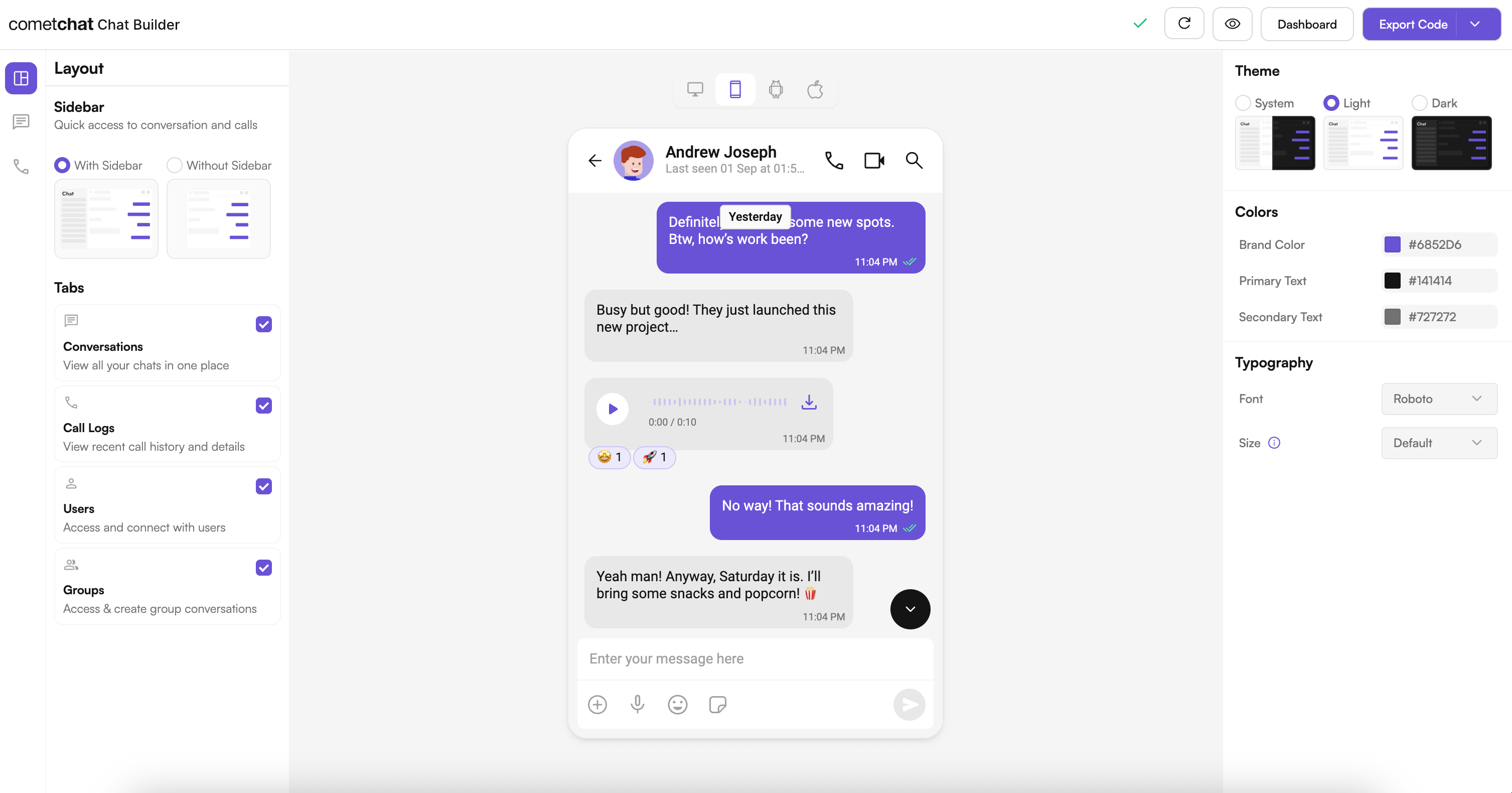
### 1. Design
Configure your chat layout, toggle features, and pick a theme using the UI Kit Builder.
 ### 2. Export
Click **Export Code** to generate a production-ready Flutter module based on your configuration.
### 3. Integrate
Drop the exported module into your Flutter project, add your CometChat credentials, and run the app. See the [Integration Guide](/chat-builder/flutter/integration) for full steps.
***
## Try Live Demo
Experience the CometChat UI Kit Builder in action:
***
## Next Steps
Step-by-step guide to integrate the UI Kit Builder.
Understand the settings file and feature toggles.
Adjust component props, behavior, and UI elements.
See how the exported code is organized.
***
## Customize Beyond the Builder
The Builder covers feature toggles, layout, and theming. When you need to change what individual components render, the exported module is built on the standard CometChat Flutter UI Kit, so you can drop down to its customization layers:
Customize message bubble content, headers, footers, and status views.
Replace specific regions of a component's UI using builder callbacks.
Override color palettes, typography, and spacing tokens.
See all UI Kit customization layers and when to use each.
***
## Helpful Resources
Try the fully featured Flutter sample for reference implementations.
Explore the complete Flutter UI Kit source code.
Configure features, manage users, and launch the UI Kit Builder.
***
## Need Help?
* Developer Community: [https://community.cometchat.com/](https://community.cometchat.com/)
* Support Portal: [https://help.cometchat.com/hc/en-us/requests/new](https://help.cometchat.com/hc/en-us/requests/new)
### 2. Export
Click **Export Code** to generate a production-ready Flutter module based on your configuration.
### 3. Integrate
Drop the exported module into your Flutter project, add your CometChat credentials, and run the app. See the [Integration Guide](/chat-builder/flutter/integration) for full steps.
***
## Try Live Demo
Experience the CometChat UI Kit Builder in action:
***
## Next Steps
Step-by-step guide to integrate the UI Kit Builder.
Understand the settings file and feature toggles.
Adjust component props, behavior, and UI elements.
See how the exported code is organized.
***
## Customize Beyond the Builder
The Builder covers feature toggles, layout, and theming. When you need to change what individual components render, the exported module is built on the standard CometChat Flutter UI Kit, so you can drop down to its customization layers:
Customize message bubble content, headers, footers, and status views.
Replace specific regions of a component's UI using builder callbacks.
Override color palettes, typography, and spacing tokens.
See all UI Kit customization layers and when to use each.
***
## Helpful Resources
Try the fully featured Flutter sample for reference implementations.
Explore the complete Flutter UI Kit source code.
Configure features, manage users, and launch the UI Kit Builder.
***
## Need Help?
* Developer Community: [https://community.cometchat.com/](https://community.cometchat.com/)
* Support Portal: [https://help.cometchat.com/hc/en-us/requests/new](https://help.cometchat.com/hc/en-us/requests/new)